Brand guidelines
Textures
The firm sells efficiency, so its textures are patterns of order: strands that untangle, lines that gather, bars that climb, dots that swell, rings that interlock. Each starts in some scatter and resolves into rhythm, the way an engagement does. They are drawn by a script, so every file is exact, and they take any brand color.
01 · The family
Seven patterns of order.
One idea in seven forms. Pick the one that matches what the piece is about, set it once, and let the words have the clear side.
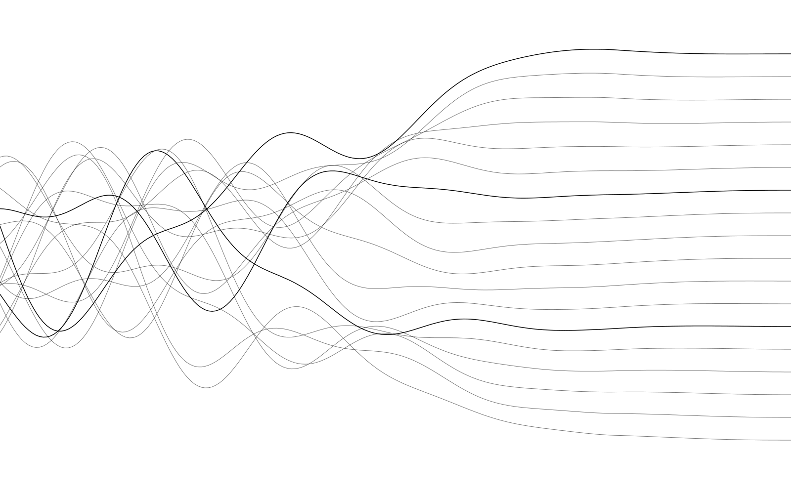
Untangle
Strands cross and weave at one edge, then run true and evenly spaced: how an engagement goes, and how the name reads.
The signature. Covers, hero panels, section dividers, the back of a printed piece.
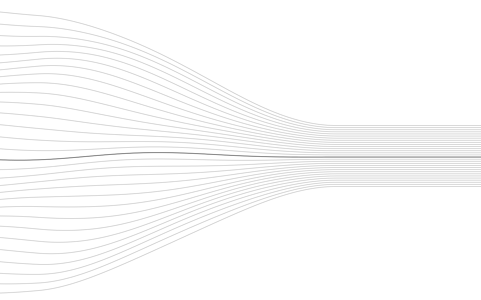
Flow
Many lines gather into one clear channel: scattered effort, focused.
Wide formats: banners, slide covers, event screens. Let the open end carry the words.
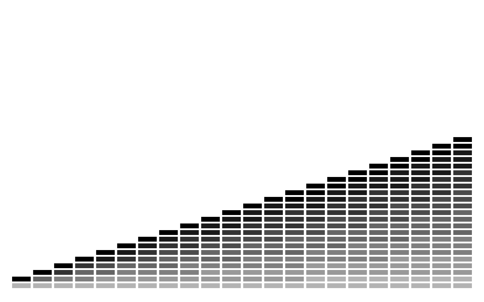
Stride
Bars climb a step at a time, each a little taller: progress, made regular.
Results, outcomes and growth. Behind a single short line, anchored at the bottom.
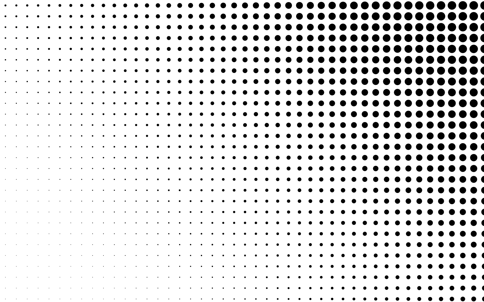
Halftone
A dot matrix swells toward one corner: momentum, kept calm.
Big quiet areas: social headers, title slides, covers. Words on the faint side.
Lattice
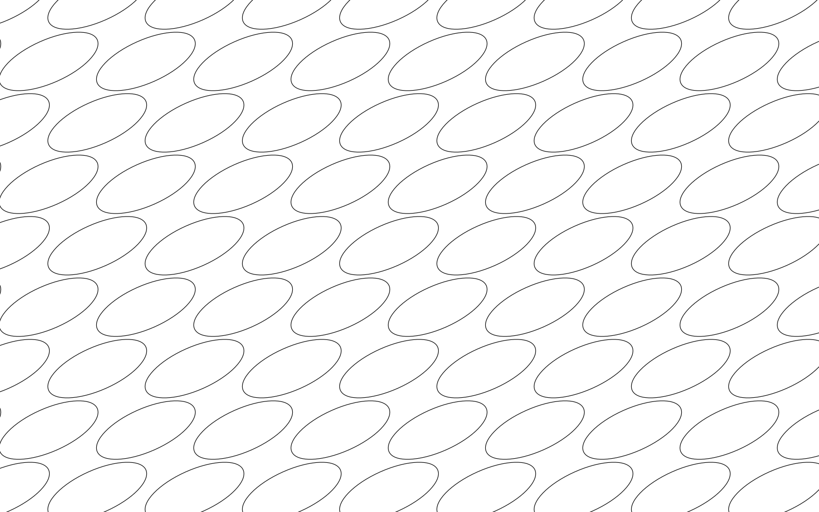
The mark’s own ring, repeated on a grid so neighbors just interlock: connection, kept tidy.
Partnership and collaboration material. Small areas, low strength.
Ledger
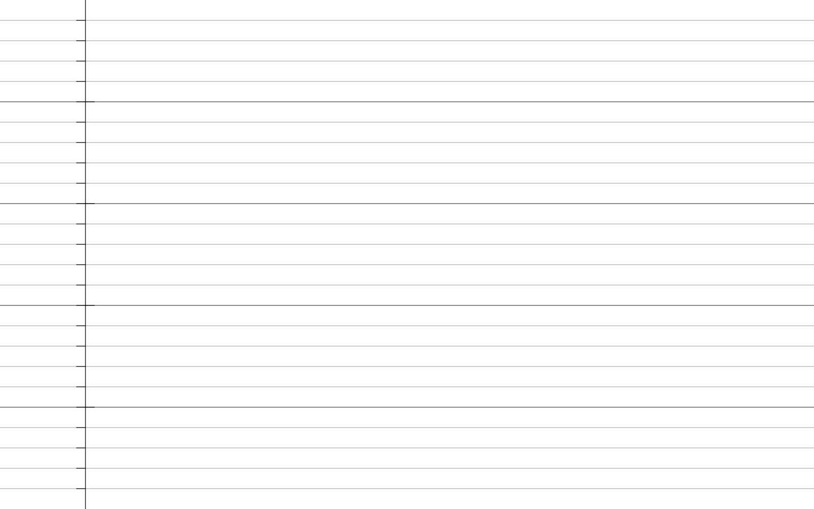
Ruled lines with a margin and ticks: work set in order.
Documents, forms, reports, anything about process. The most restrained of the family.
Modules
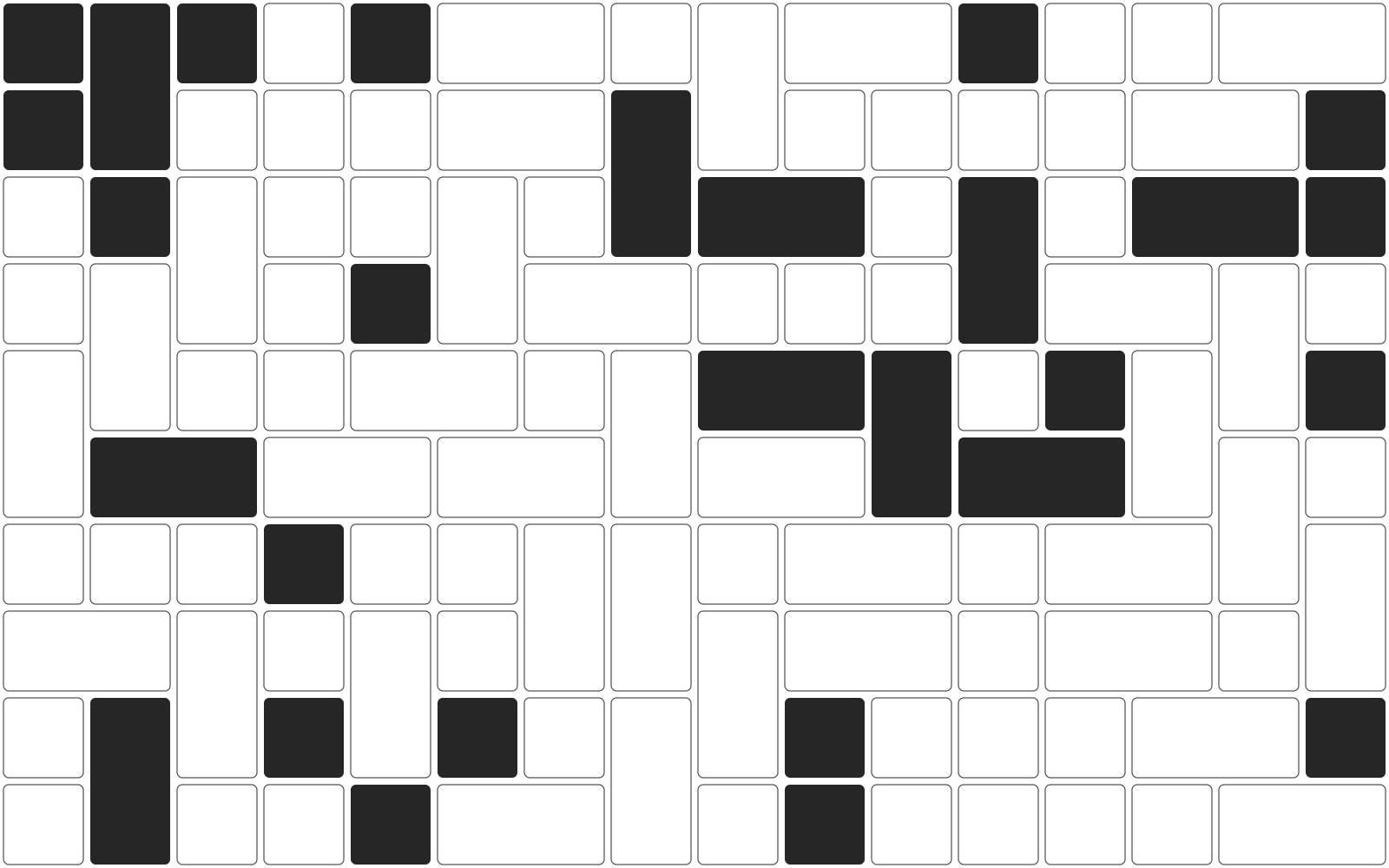
Tidy blocks, some joined, a few filled: units of work, packed with no waste.
Services, delivery models, capability pages. Keep it to one panel.
02 · In motion
Untangle, as you scroll.
The signature texture, set moving: a tangle of strands resolves into ordered lines as the page is read. The same drawing is used on the home page. Scroll slowly; it follows you.
Untangle
Strands resolve into order
The signature texture, set moving
Four strands, one team · scroll to resolve
Structure, not data
03 · On color
One texture, five grounds.
The same drawing on each brand ground, at the strength that keeps words readable. Textures sit behind a headline or the lockup, never behind paragraphs.
Order
On Cloud
26% strength
Order
On Midnight
40% strength
Order
On Sky
34% strength
Order
On Mist
28% strength
Order
On Iris
34% strength
04 · Use
Where textures go, and where they don't.
Yes
- Slide covers, section dividers, banners, event screens, the backs of printed pieces.
- Behind the lockup or a single short line.
- One texture on one surface, in one color.
Strength
- Fine-line textures (untangle, flow, ledger): Midnight at 24 to 30% on Cloud, Mist or white; Sky at 36 to 44% on Midnight.
- On Sky, Midnight at 30 to 38%; on Iris, white at 30 to 38%.
- Heavier textures (halftone, stride, modules) run at about half of that. Lattice stays quiet.
No
- Behind paragraphs, forms or data. The website stays plain, as Primer does; the exceptions are the home and hero panels.
- Two textures on one surface, or a texture on a photograph.
- Recoloring parts of a texture, or animating it for attention. The only motion is untangle, drawn by the scroll.
Files
Untangle
Black on transparent; recolor in any tool
Flow
Black on transparent; recolor in any tool
Stride
Black on transparent; recolor in any tool
Halftone
Black on transparent; recolor in any tool
Lattice
Black on transparent; recolor in any tool
Ledger
Black on transparent; recolor in any tool
Modules
Black on transparent; recolor in any tool
Made by scripts/brand/textures.mjs. Plain geometry, no randomness except one seeded pack for Modules: same code, same drawing.